


黄砂 Kosa
黄砂、PM2.5、そして花粉!
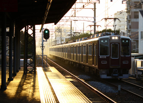
どれをとってもくしゃみが出るような嫌な気分になる単語だけれども、写真に撮ってみたら朝もやのようでもありなんだか少し幻想的。
そこから走ってくる阪急電車も心なしか少し立派に見える・・・
色を見ただけで何線か分かるJRのような車体もいいけれど、ちょっぴり不便ではあるものの全線小豆色で統一された阪急電車は僕が乗ったことのある電車のデザインの中ではチャンピオンだと思う。
色や素材を押えるとデザインはまとまる、ということの好例ではないかとも思う。
便利のためだったり、様々な人の好みに応えるために増えてきた世の中の物の選択肢。
それを「豊か」と時にはいうかもしれないけれども、調和というデザインにおける大事なキーワードにおいては障害となっているようにも思える。
阪急電車を見るたびにいつもそう考える。
Kosa, PM2.5 and cedar pollen!
Any of these words make me feel like I almost sneeze, but it looks like morning mist and little bit fantastic in a photo…
JR lines are very convenient since they are discriminative by their body colors, but I think the design of Hankyu lines is champion among the trains I’ve ever rid by its simple reddish-brown colored body at all lines even they are bit hard sometimes to distinguish.
This might be a very good example that how the design can be sophisticated with limiting colors and materials.
The choice of things in the world is increasing day by day along to satisfy the people’s want.
Sometime we call it “wealth”, but this might be an obstacles sometimes for the better world in terms of design harmony.
I always thinking about it when I look at this Hankyu railway.
Photo: Hankyu railway Kobe line at Mukonoso station.